Pro Tips
Colors… or your brain’s interpretation of assorted frequency light waves hitting your eyes… are our world at Kryolan. Our scientists’ work with over 170 pure pigments to bring you every shade you could possibly need.Color Theory - Beginner
As both scientists and creatives, we are fascinated by color theory. It underpins the work of every artist we create make-up for and Paul Merchant, head of make-up at Kryolan UK, says, ‘Color theory is essential in make-up artistry, certainly as important as technique. Without the knowledge of it make-up artists would struggle’. The science of color theory enables artists to not only recognize, match and correct skin tones, but also achieve eye-catching, memorable and visually successful make-up looks. Here we explore the principals of color theory; the color wheel, color harmony, context and psychology, and the colors that are not really colors.
Invention of the wheel
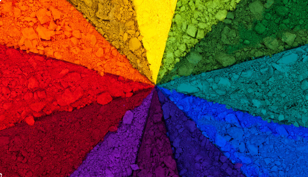
The color wheel, a logical sequence of colors in relation to each other, illustrates color theory. The commonly used, circular diagram of colors based on red, yellow and blue – or RYB - was developed by Sir Isaac Newton in 1666. Since then, scientists and artists have come up with many other wheels, but the original circle remains the most viable for MUAs. The RYB color wheel features 12 hues in total. Primary colors; red, yellow and blue. Secondary colors; green, orange and purple - the hues formed by mixing the primary colors. And finally, tertiary colors; yellow-orange, red-orange, red-purple, blue-purple, blue-green & yellow-green - these are the colors formed by mixing a primary and a secondary color. Many color wheels show bright hues, and it’s important to remember that color theory itself isn’t specifically relevant to the strength of a pigment or vibrancy of the color.Jos Brands, head of education at Kryolan International says: ‘No matter what make-up look I’m creating, I always regulate the skin tone with RYB color theory in mind. As an MUA you need to control the colors in the face. Colors that are different from a natural skin color are perceived as ‘unhealthy’ so we need to balance them with complementary colors. For example, red in the face can be neutralized with a green undertone.’
Paul Merchant adds: ‘In nearly every training course I deliver, someone will ask me how to disguise dark circles under the eye. I tell them this is simply not possible without color correction and as soon as you show people they’re amazed, but it’s basic color theory.’
Peace and color harmony
Harmony can be defined as pleasing to the eye - a balance in the visual experience. Harmony delivers visual interest and a sense of order that is crucial to any successful make-up look. There are many theories for color harmony – we’ve included a useful breakdown of some of these formulas later in the feature - but methods most commonly used are analogous, complementary and nature-based. Analogous colors are any three colors that are side by side on a 12-part color wheel, such as yellow-green, yellow, and yellow-orange. Complementary colors are any two colors that are directly opposite each other on the color wheel - such as red and green, or red-purple and yellow-green. These opposing colors create perfect contrast and maximum stability.Nature-based provides a perfect color harmony. Red, yellow and green create a harmonious design, regardless of whether this combination fits into a technical formula for color harmony. In essence, all of the basic harmonies can come into play when balancing a make-up look. Jos Brands explains: ‘When educating make-up artists, one of the first things I teach is that you can be as creative as you like through the use of color, as long as it technically works in harmony with the other hues you choose’.Putting color into context
Red appears more brilliant against a black background, but duller against white. In contrast with orange, red appears lifeless, but in contrast with blue-green, it’s brilliant. Colors can be perceived as completely different based on which hues they’re shown alongside. Understanding the effects colors have on each other is crucial for a make-up artist. The warmth or coolness of respective hues can also cause noticeable differences in our perception of color.When a color is not a color
Scientifically, black and white are not classed as colors because they do not have specific wavelengths. Instead, white light contains all wavelengths of visible light. Black, on the other hand, is the absence of visible light. Black & white remain, however, two of the most important shades on a MUAs palette - colors or not.
Powerful effects
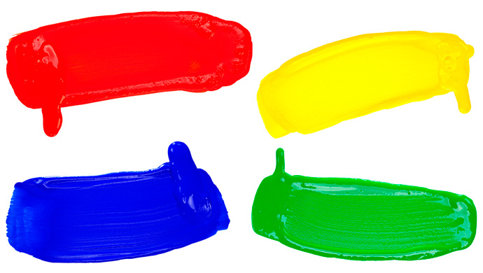
The effect color can have beyond aesthetics is another area MUAs need to have a grasp on. It should be approached with care and in-line with the principals of color harmony to achieve the desired positive effect. There are four key psychological hues - red, blue, yellow and green, but all colors relate to body, mind and emotions.Red has the longest wavelength and is known for its physical effects. It is a powerful, stimulating color because it appears to be nearer and therefore attention grabbing. Think of the power of the red lip. Pure red is lively and friendly, but can be perceived as demanding and aggressive.
Blue is the intellectual color. Its effect is mental rather then physical and can stimulate clear thought, serenity and concentration. As with all colors, there’s another side to blue, and it can also be perceived as cold and unfriendly.
Yellow is emotional. Its wavelength is long and stimulating and is the strongest psychological color. Depending on the shade, it can lift confidence and self esteem, but can also evoke fear and anxiety.
Green is balance as it appears in the center of the color spectrum. It can evoke a restful effect and on a primal level, people are reassured by green as it indicates health and prosperity. However, in certain hues, it can also be perceived as ‘stagnant’ and bland.


